Tufts Dash
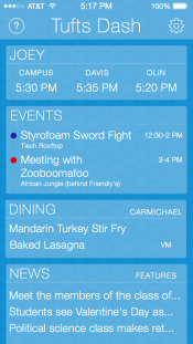
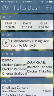
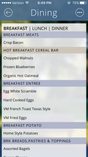
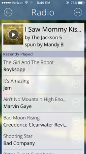
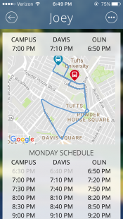
Tufts Dash is a web application that displays Tufts' shuttle location, dining hall menu, and radio station livestream in one centralized dashboard. It was the second project of our Tufts MAKE club and the result of a multi-semester collaboration between computer science, mechanical engineering, and human factors students.
The web app is still online and functional today, and our GitHub repository is ready for a future generation of students to pick up. The project was covered in our school's newspaper and continues to be an excellent example of the kind of interdisciplinary learning that Tufts MAKE was founded to support.
Background
During Tufts MAKE's second semester a number of students expressed interest in learning how to design and create iOS/Android apps. Our club's leaders weren't very familiar with app development, but were excited to learn more about it together just like we did through the Oreo De-Creamer project.
This project was the second time we practiced a Design Sprint-esque process, and we tried to combine it with some IDEO-inspired human-centered design by testing it with users along the way. This was also our club's first software project and a welcome relief from the many physical prototyping barriers we were bumping up against at the time.
Our process
Understanding the problem
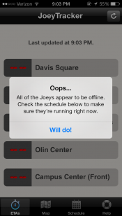
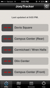
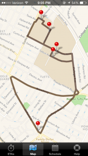
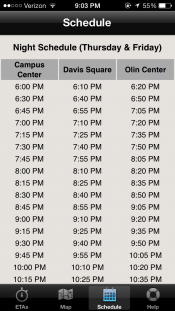
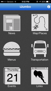
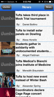
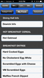
We kicked off our first meeting in January of 2014 by compiling a list of existing Tufts-related apps and websites and the problems they tried to solve. There were two cross-platform smartphone apps at the time named JoeyTracker and iJumbo that offered the following:
- Shuttle schedule and location (broken)
- The dining hall's menu
- Tufts Daily news headlines
- Upcoming events
There were a few other desktop-oriented sites that could be used to find the following:
- Laundry room status (Flash-based)
- Tufts WMFO radio station stream (Flash-based)
- Tufts sports scores
As students ourselves we found the experience of regularly jumping between these apps and sites to be quite annoying. We started to wonder whether we could combine all of this information into a single, customizable "dashboard" app.
This "Tufts Dash" idea seemed doable given our time constraints and limited experience, so we began to sketch out ideas.
Sketching and deciding
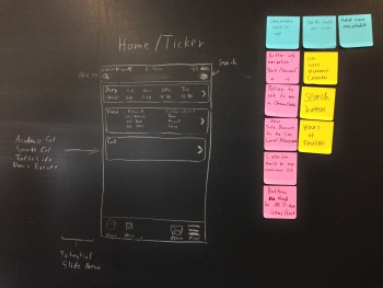
Our group held multiple design sessions to figure out how the app could work. As we drew and discussed feature requirements we captured those ideas on Post-Its and pasted them next to our chalk prototype.
One member thought that separating each chunk of information into "bubbles" similar to iMessage or Evernote could be an effective way to visually organize the dashboard and eliminate the need for a traditional navigation bar along the bottom. A "Dining" bubble, for example, would display their favorite dining hall's entrées on the main screen but could grow or slide over to display the rest of the menu when tapped.

The modularity of the bubble UI seemed particularly appealing from a development perspective because it ensured that there wouldn't be a "hole" in the dashboard if we couldn't finish every feature before the end of the semester. It also restricted rearrangement to just one vertical axis and opened up the possibility of a natural-looking iPad or laptop UI in the future.
We all agreed that the bubble UI was the way to go, and started turning our sketches into an interactive prototype.
Testing a proof of concept
One of our students was somewhat familiar with creating interactive prototypes using Axure, but he needed better-looking assets to work with than what Axure could produce. I had heard about a new app called Sketch, so I bought it and learned the basics to create a few screens while checking the design on an actual iPhone 5 using Sketch Mirror.
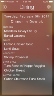
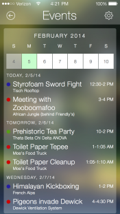
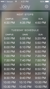
As crude as this first prototype was, it was good enough to yield valuable feedback. Students generally thought that we were on the right track with the "dashboard" idea, but white text and weird spacing made the information difficult to read and parse. Our team also struggled to figure out where to include a settings button and how to naturally animate the transition between views.
We decided to start exploring the iOS and Android development tools to see what would be easy to build using their pre-built components while a few of us continued to tweak the design.
Choosing a platform
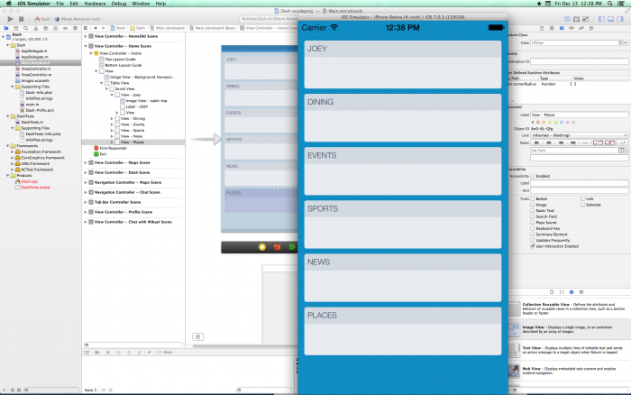
Our attempt to replicate our concept using Apple's Xcode.
Our group split up to research what it would take to build and publish our apps on iOS and Android. A few of us started digging into Apple's Xcode and managed to get a scrollable Table View running in the Simulator. Another student looked into Android development, but Android Studio didn't exist yet and the path to publishing in the Google Play Store seemed much less straightforward. I started learning about installable Home Screen web apps with another student and we came across Apache Cordova which seemingly offered an easy path to publishing on both iOS and Android with a single code base.
Some of us were already familiar with HTML, CSS, and JavaScript, so building a web-based application and (potentially) packaging it with Cordova seemed like the best approach. Publishing it on the web also meant that it could be viewed on laptops and shared across campus more easily whenever we began to market the app. The relative approachability of web technologies compared to Objective-C and Java also made more long-term sense if the project was ever picked up by another team in the future.
With our technology stack agreed upon we created our first GitHub repository, familiarized ourselves with Git-based version control, and began replicating our design in actual code.
Iterative prototyping
Our team continued to meet for multi-hour coding and design sessions throughout the year, learning with and from each other along the way. Our computer science student taught our mechanical engineer the basics of JavaScript while I worked with the human factors student who maintained our Sketch file to turn it into HTML and CSS and improve the app’s legibility.
We eventually decided to forgo Cordova (and paying to publish in app stores) in favor of an installable web app instead. I read up on app manifest files and asset caching to make it work offline while our other developers figured out how to retrieve each day's dining hall menu. Through some sleuthing they figured out how to create a realtime shuttle map using GPS data from Tufts' new transit tracking partner DoubleMap. I also created a widget to play our radio station's livestream and pull in album artwork for the current track using Apple's iTunes Search API.
Our team continued to develop the app and share it with friends until early 2015 when a few of us shifted focus to our upcoming graduation. We never ended up marketing the app across campus, but according to our Google Analytics it ended up reaching over 2,000 unique visitors by the time we ended the project.
Tufts Dash is still available at tuftsdash.com and the shuttle, radio, and dining widgets continue to work to this day.
Walkthrough
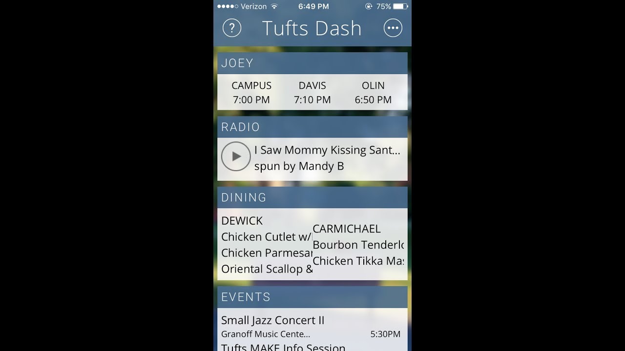
Takeaways
Tufts Dash was the first truly interdisciplinary project of our Tufts MAKE club and a great example of the kind of organic, project-based learning we were striving for. It was also a perfect opportunity to try out new technologies and practice a variety of useful "hard" skills:
- User Interface Design & Prototyping
- Collaborative coding
- Git version control
- GitHub
- App development
- Web development
- HTML/CSS and JavaScript
- Responsive web design
- Working with external APIs
- Cross-Origin Resource Sharing (CORS)
- Offline web apps
For me, Tufts Dash was also another opportunity to work alongside my excellent club co-founders and to help other students learn about new disciplines and technologies through making. My advisor later told me that showing off cool projects like Tufts Dash and the Oreo De-Creamer to prospective students even contributed to the four-fold growth of Tufts' Human Factors program by the time I became a graduate student.
Seeing Tufts Dash and the rest of Tufts MAKE's projects, workshops, and events tangibly contribute to Tufts' maker culture was one of the highlights of my Tufts career.

