Dragon Mobile Assistant
This was the senior capstone design project that I worked on with the same group of talented Tufts students that co-founded Tufts MAKE with me a few years prior. Over the course of two semesters we practiced our skills in Human Factors research methodology and prototyping to develop new in-car and proactive experiences for Nuance Communication's Dragon Mobile Assistant (DMA) application.
Our project received a rarely-awarded "A-" and our extensive final report ended up becoming the in-class example for future generations of Human Factors students to refer to.
Background
Students in Tufts University's undergraduate Human Factors program are required to take a year-long, project-based senior design course in which teams of students tackle real-world design problems submitted by corporate sponsors from the Boston area. The course is intended to be a summative experience for soon-to-be graduates and provide an opportunity for them to demonstrate and practice the full extent of their Human factors expertise.
I chose to work with the same dream team of students that helped me co-found Tufts MAKE and de-cream Oreos during our sophomore year, and together we tackled two project proposals submitted by Nuance Communications; creator of the natural language processing systems that powered early versions of Siri and other voice-powered assistants.
I served as the team's leader, prototype designer, and enthusiastic assistant whenever and wherever my help was needed. Most of our project's user interface was created by me using Sketch and Pixate, and as the team's coordinator I submitted weekly project reports, scheduled and led meetings, and lent a helping hand to each of my team members:
Our task
Nuance's Dragon Mobile Assistant is their consumer-facing natural language speech assistant app and a showcase for interesting new features. Two designers on their team oversaw our work and challenged us to:
- Investigate what it means for a speech assistant to be "proactive"
- Assess user expectations of proactive systems (use cases, annoyances, privacy concerns, etc.)
- Assess the current landscape of predictive experiences (competitive analysis)
- Identify the technical "hooks" through which predictive experiences could be made meaningful and personal
- Propose and design predictive capabilities for DMA
- Explore a new speech assistant experience tailored to in-car use
- Assess in-car and device user behaviors, expectations, and wants
- Assess safety considerations for in-car and device behavior
- Evaluate and compare the current DMA "car mode" experience to other in-car experiences (competitive analysis)
- Propose a holistic DMA experience that allows users to interact with the assistant on the device and in the car
Exploratory research
Literature review
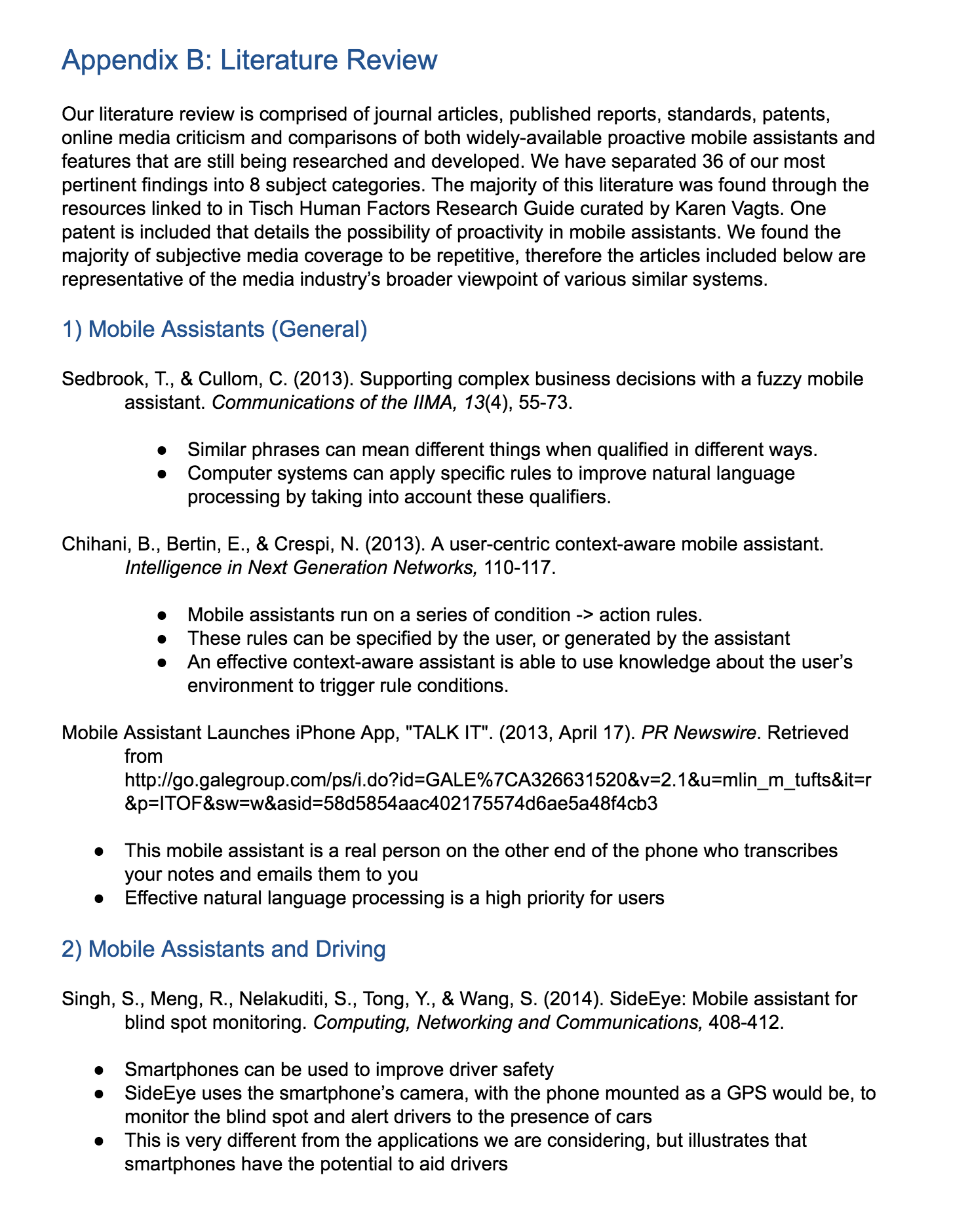
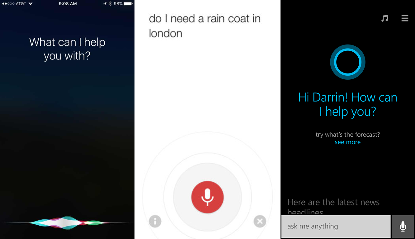
To familiarize ourselves with the latest research findings on hands-free device usage and the market positioning of the most popular mobile assistants of the day - Siri, Google Now, and Cortana - we conducted an extensive literature review of books, journal articles, patents, U.S. standards, and technology news. We recorded our most pertinent findings from each source into the following 7 categories:
- Mobile assistants (in general and while driving)
- Hands-free device use while driving
- Audio and speech recognition standards
- Proactive assistant systems
- Patents
- Assistive technology applications of mobile assistants
- Online media criticism and comparisons
The most interesting bit of information we learned was that despite the public's notion that "hands-free" operation is safer than hand-held use, driving impairment is highly dependent on the type of task and the user's cognitive load when interacting with the system. This made us wonder whether we could improve hands-free safety simply by asking users to talk to their mobile assistant as if it were another human sitting in the car; an idea we would eventually test out.
Expert review & task analysis
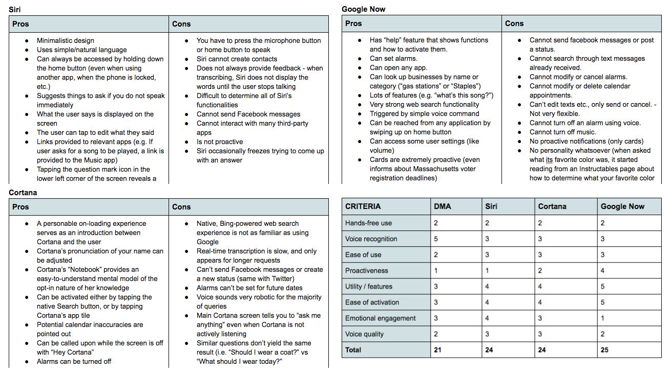
Our team conducted an expert review of the most popular mobile assistants of the time (Siri, Google Now, Cortana, and DMA) in order to directly compare their strengths and weaknesses. We ranked each one based on their alignment with 7 common qualities of "good" mobile assistance that we developed through our literature review. To supplement this review we also quantified each assistant based on the number of steps they required to complete 7 common tasks: setting an alarm, making an appointment, getting directions, playing a song, converting a measurement, sending a message, and checking the weather.
Our ranking and analysis provided our team with a data-driven reference point that our eventual prototype could be directly compared to.
Our team compared and analyzed the capabilities of Siri, Google Now, and Cortana
Focus groups, surveys, and personas
As all good Human Factors professionals know, no amount of reading can replace in-person discussions with actual users. We conducted two focus group sessions and asked people about their assistant-related annoyances, success stories, driving experiences, proactive features, and general usage to derive a few key insights:
- Above all else, natural language recognition is the most important (and most frustrating) part of using mobile assistants.
- Most people aren't aware of what their mobile assistant can do, which might be remedied with a collection of sample commands.
- An assistant that could integrate with navigation apps to support tasks like finding the nearest gas station could be helpful.
- The ability to change phone settings or create custom command macros also seemed helpful.
The information we received from these focus groups lined up with the survey response data we collected of over 250 Tufts-affiliated mobile assistant users, helping us identify key driving-related tasks and issues that our future prototype could try to address.
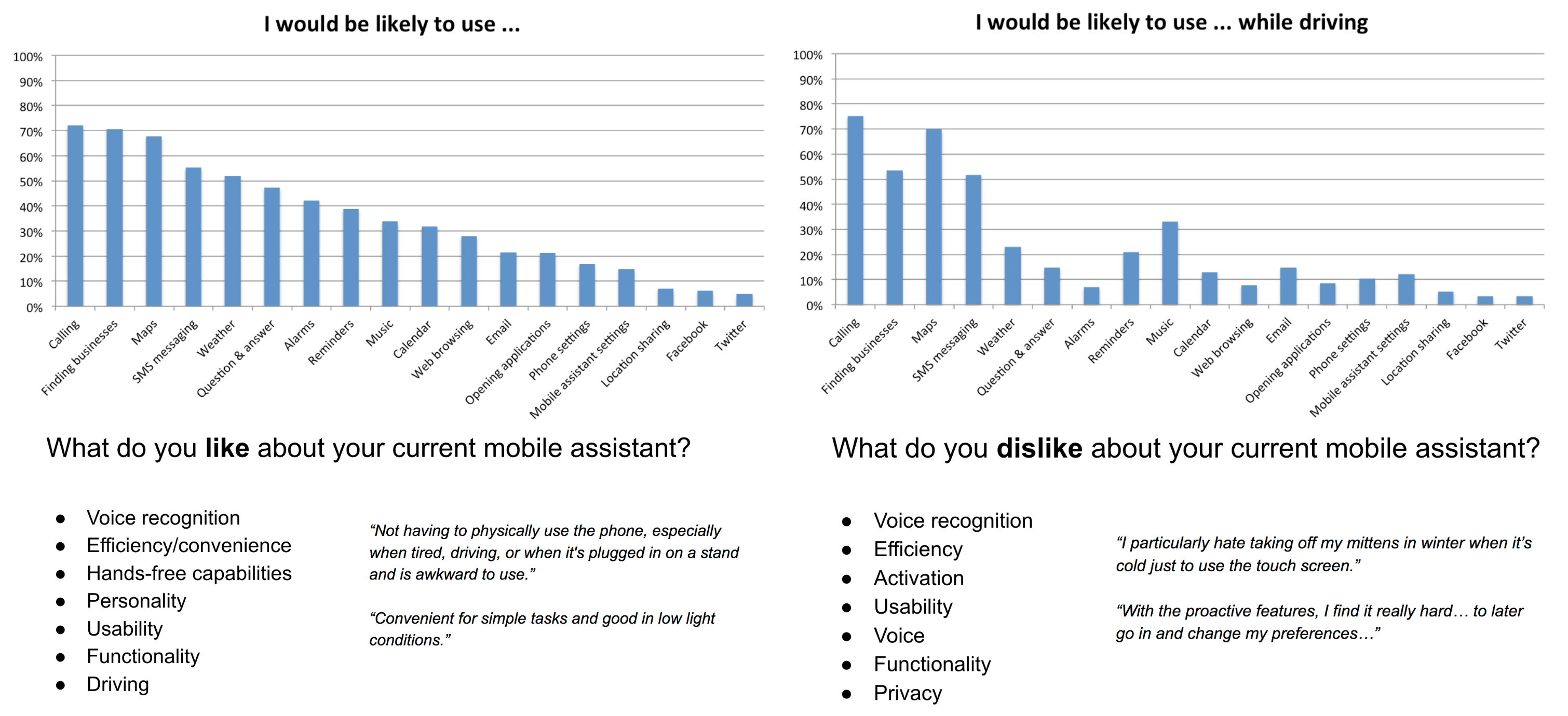
Survey data results that helped us identify key driving tasks and annoyances
To get a better sense of DMA's existing user base, Nuance provided us with 6,640 in-app survey responses with demographic information that helped us create semi-realistic personas of a few typical DMA users.

Feature requirements
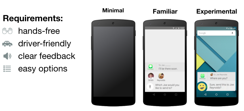
Each piece of our background research informed the compilation of 50+ prioritized feature requirements for our eventual prototype. Some of these requirements were specified in the original project proposal, but most were either features that DMA's competitors included or new ideas that could help differentiate DMA from alternatives. We organized our features into four categories: driving mode, activation, ease of use, and proactivity.
With these feature requirements finished we were finally prepared to begin developing our own mobile assistant concepts and create testable prototypes.

Design process
Diverging and deciding

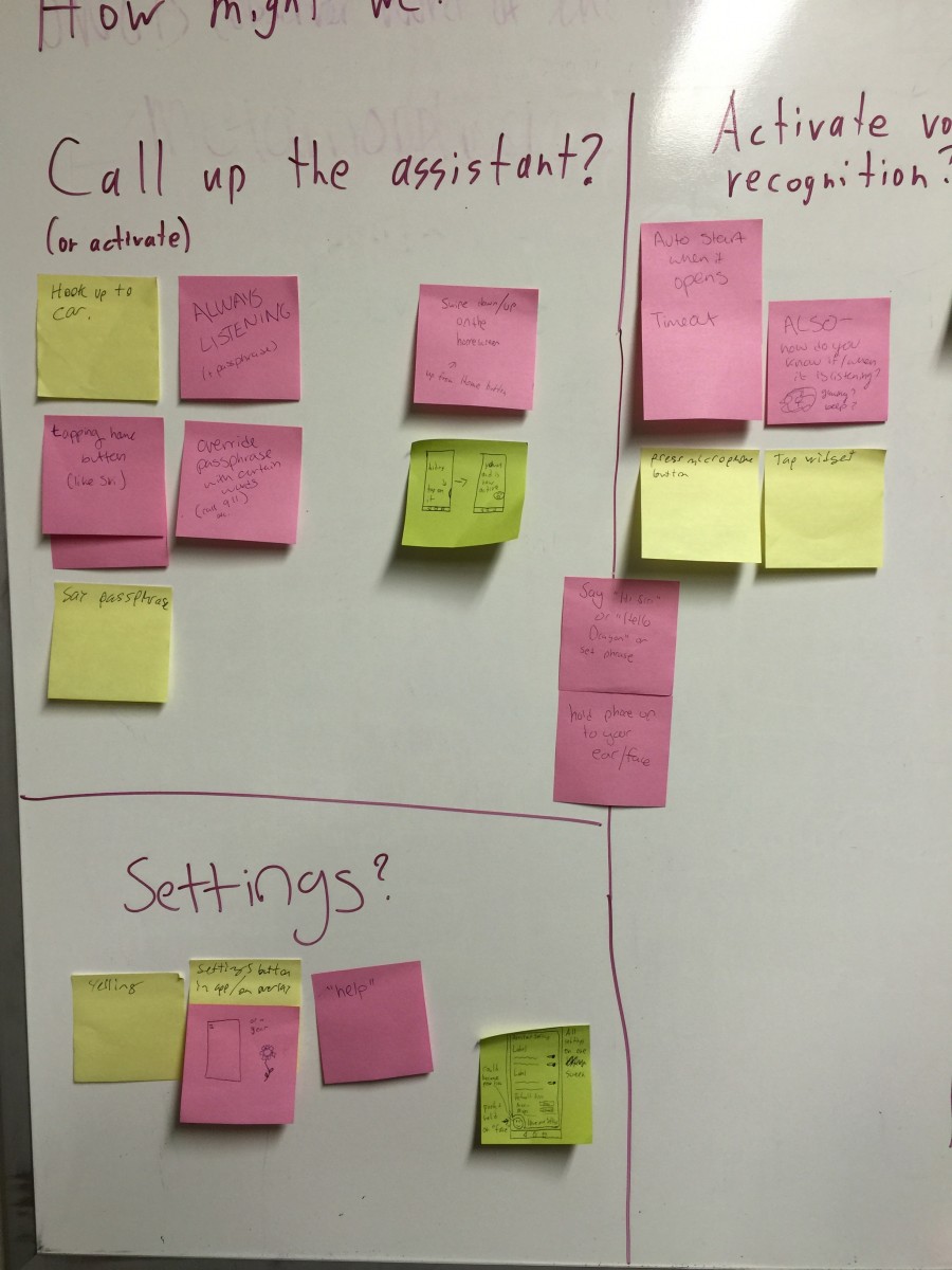


Our years of prototyping experience through Tufts MAKE came in handy as we began to consider how our own mobile assistant prototype might look and function. We organized all of our thoughts on a whiteboard and came up with a few different approaches that seemed interesting. Each concept incorporated research-backed ideas about how mobile assistants should work and function but had radically different user interfaces.
Instead of just one prototype we came out of our design session with three, and decided to test each one to see how they might be combined into a single interface.
Prototyping
Concept 1: Minimal

Our first concept codenamed "Zubat" was a voice-only assistant with no visual interface or feedback whatsoever. We used our task analysis notes to create an efficiency-oriented auditory framework that incorporated some basic predictive features and allowed users to correct errors at any point during their interaction.
The goal with this concept was to see how users would react to audio-only feedback with a typical, robotic-sounding assistant. Stripped of all personality and visual indicators, we were interested to see whether users preferred this kind of assistant and how effectively they could use it to complete tasks while driving.
Concept 2: Familiar

Our second, more familiar concept named "Mittens" used the same vocal framework as the first but added a visual interface to provide on-screen feedback and enable touch-based editing. This concept was most similar to the existing DMA app but included more natural error correction and a chat-like interface that displayed the entire history of the user's conversation with the assistant.
This concept was intended to be a baseline that users could compare to our first and third concepts during our usability tests.
Concept 3: Experimental
Our third "Katamari" concept was a futuristic, human-like mobile assistant intended to defy and surpass user expectations. It replaced the standard microphone icon with a customizable "face" and used colloquial language to encourage users to speak to it more naturally. Its overlay interface made it feel less like a siloed app and more like a persistent companion that could augment and interact with other apps on the user's behalf.
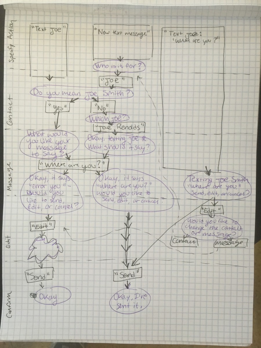
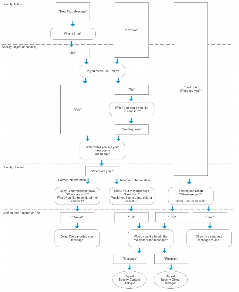
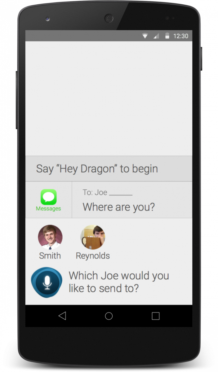
Like a human, Katamari was also capable of making informed assumptions to speed up common tasks. If the user wanted to text "Joe", for example, Katamari would text the most frequently-contacted Joe using whichever messaging app they typically used to talk to him.
Some of Katamari's features weren't technically possible at the time, but acting as if they were allowed us to gauge user interest in certain features and provide Nuance with forward-looking experiences to shoot for.
Usability testing (round 1)
Our first usability test was a quick one intended to help us answer two questions:
- When driving, do users prefer Concept 1 (screen off, procedural vocal framework), or Concept 2 (screen on, same vocal framework)?
- When not driving, do users prefer Concept 2 (no proactivity, robotic speech), or Concept 3 “Katamari” (significant proactivity, colloquial speech)?
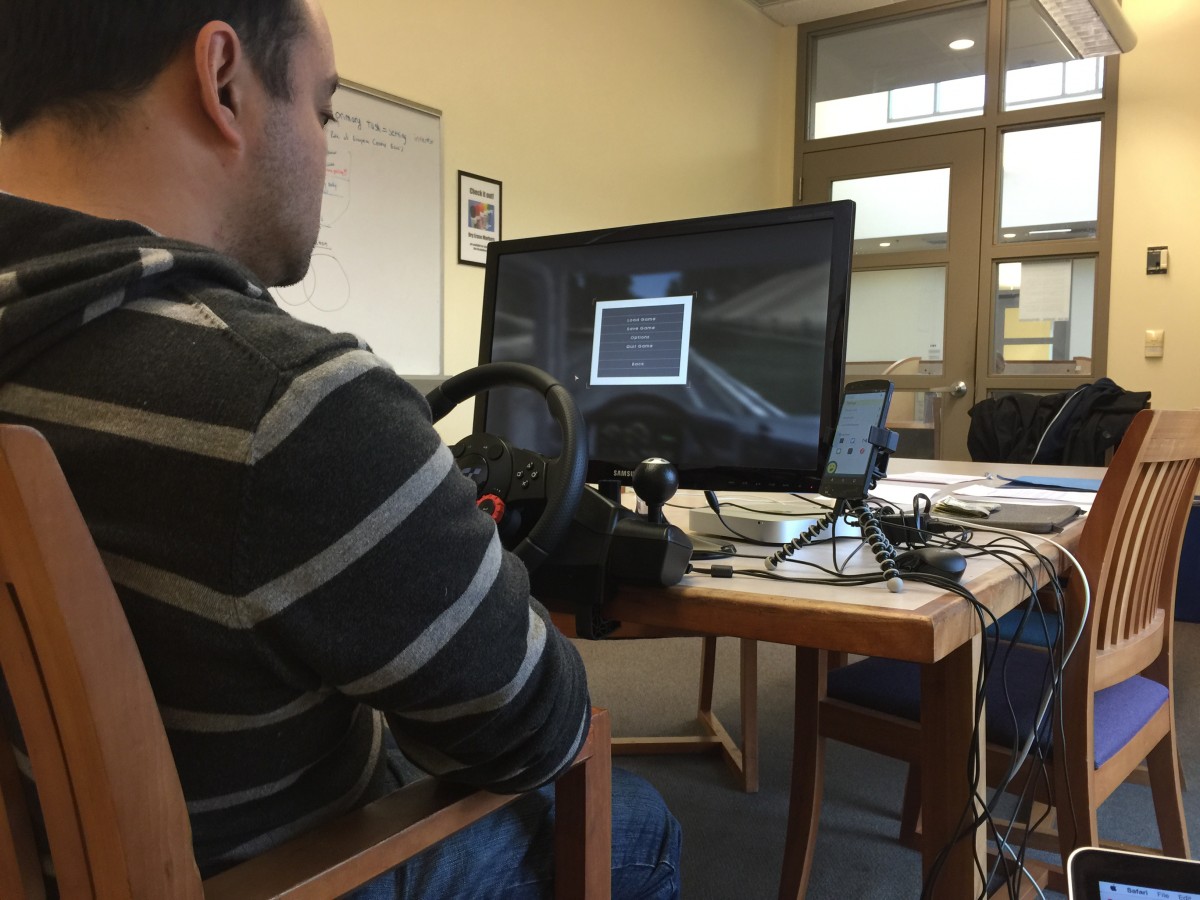
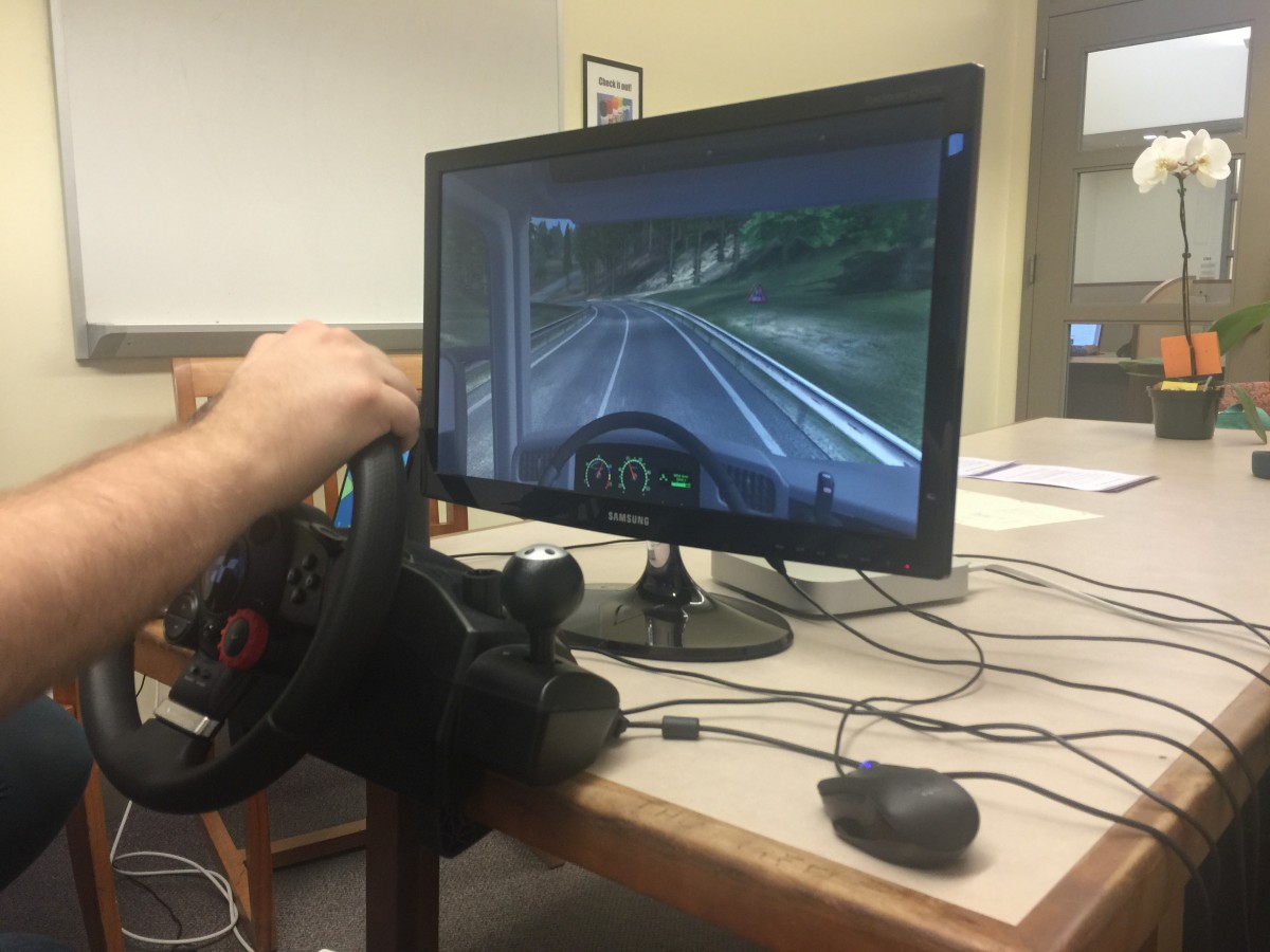
We recruited 10 college-age participants and had them complete texting and navigation-related tasks within driving and non-driving contexts. Participants in our driving condition had to complete their tasks while driving a virtual truck in EuroTruck simulator using a Logitech driving wheel and pedals. After each task we had each participant answer a few questions related to the perceived difficulty of the task, their satisfaction with the assistant, and their level of comfort while driving.
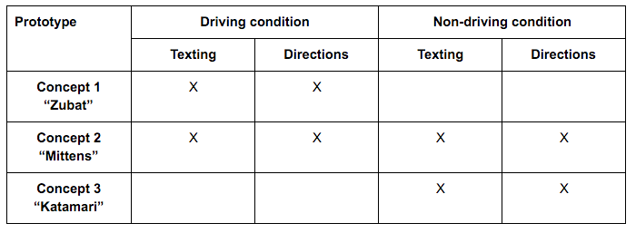
The conditions of our first usability test. We excluded Zubat from our non-driving condition and Katamari from our driving condition to save time and simplify our experimental conditions
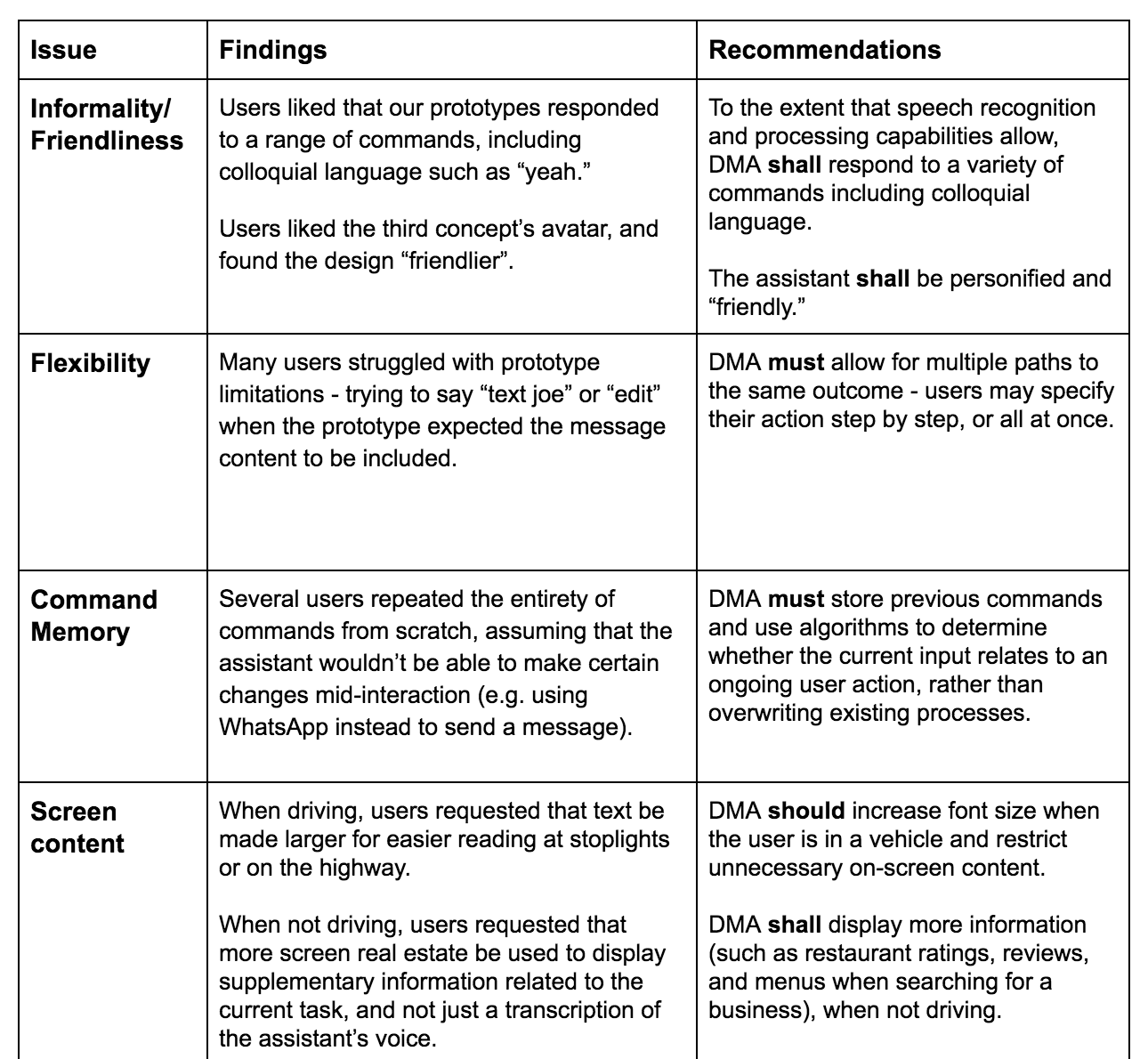
We derived design recommendations based on our first usability test findings
Participants generally found Concept 2's display distracting and preferred the voice-only interface of Concept 1 while driving. Non-drivers preferred Concept 3's overlay interface and interesting use of predictive capabilities over the more standard UI of Concept 2.
We also noticed that participants who were already familiar with mobile assistants tended to speak to our concepts very deliberately and robotically to avoid potential errors. We knew from our research that removing that cognitive overhead could improve task performance, so we kept that in mind as we began to work on a new prototype.
Converging and revising
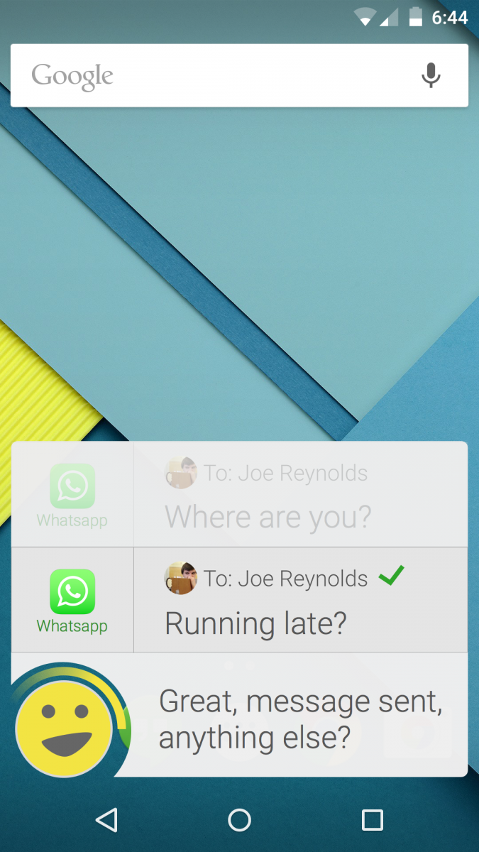
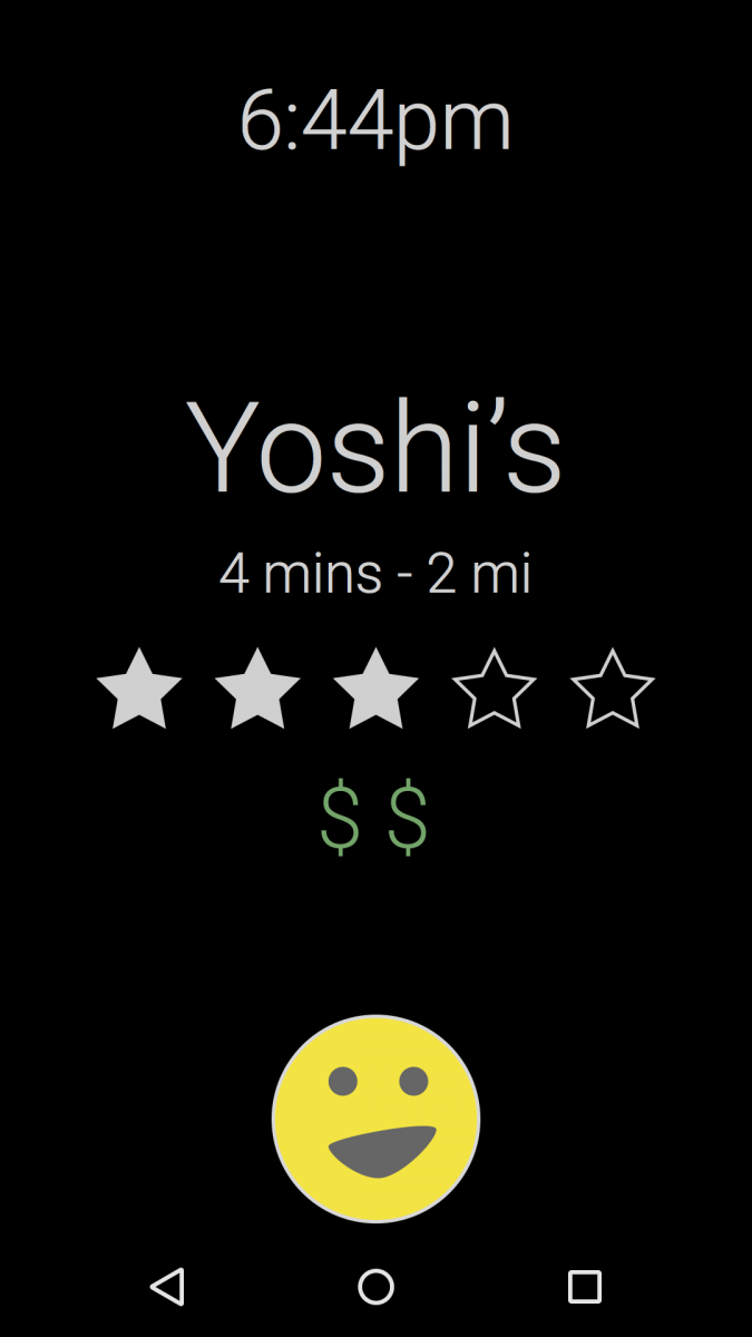


After a few more weeks of design prototyping we successfully combined the visual style and intelligence of Concept 3 with the familiarity of Concept 2 and the efficient vocal framework of Concept 1 to create our own forward-thinking version of the Dragon Mobile Assistant.
I worked with another team member to create an interactive medium-fidelity prototype using Pixate and Reveal.js that we could operate remotely during our next usability test in a "Wizard of Oz"-like way. As participants interacted with our prototype we could switch between screens and play audio clips that made our assistant feel more real than it was.
Our team incorporated more of our initial feature ideas into the new prototype and created an introductory experience that would encourage participants to speak to Dragon more naturally than they would to Siri, Google Now, or Cortana.
Usability testing (round 2)

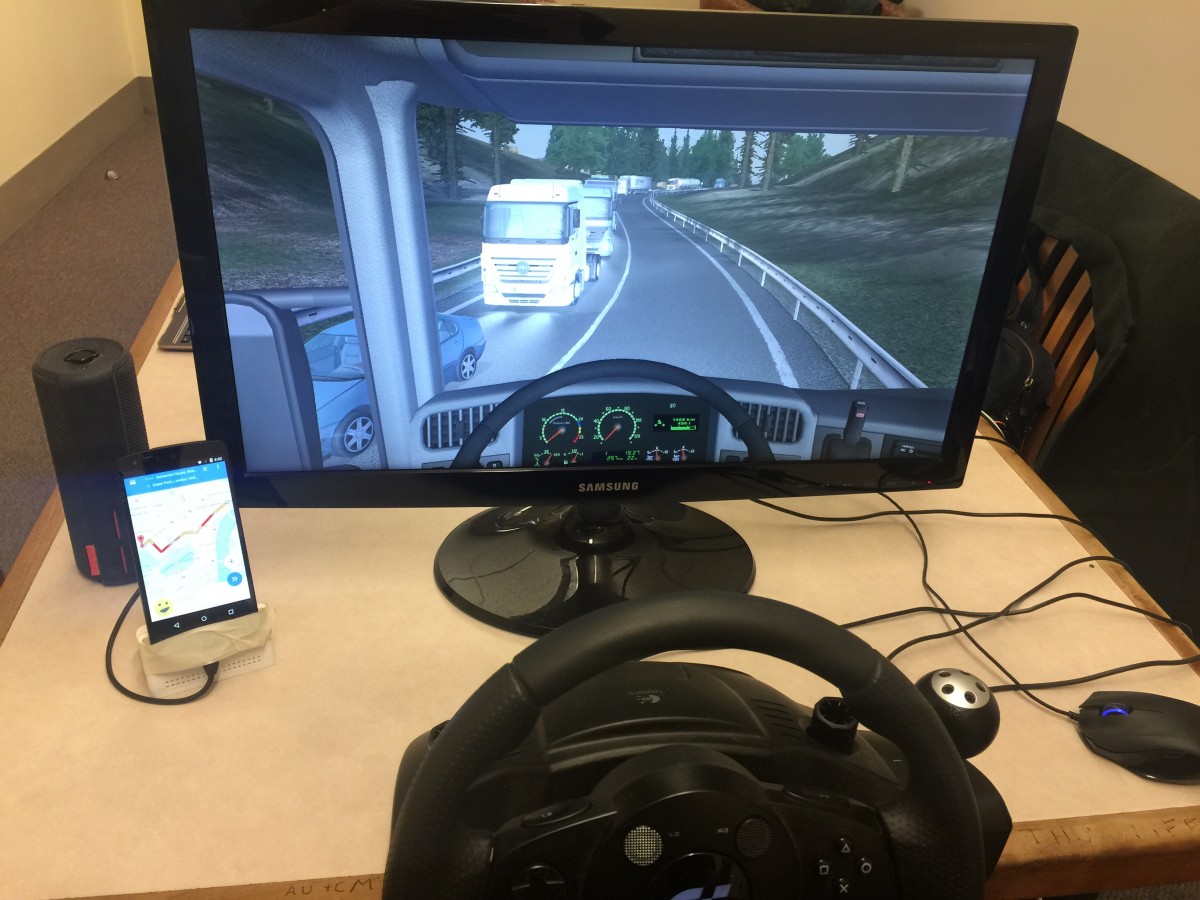
For our second usability test we recruited 10 participants between the ages of 18 and 67 to more closely reflect DMA's existing user base. Each participant completed a set of 7 driving and non-driving tasks using the same driving simulator setup. One of our team members moderated the test while another took notes and a third operated the prototype remotely.
- Introduction
- Dragon introduces itself, asserts that it's "smarter" than other assistants, and explains its unique overlay interface.
- Engage Driving Mode
- The user figures out how to initiate driving mode manually or assumes that it would be smart enough to start it automatically.
- Restaurant search (adaptive prompting)
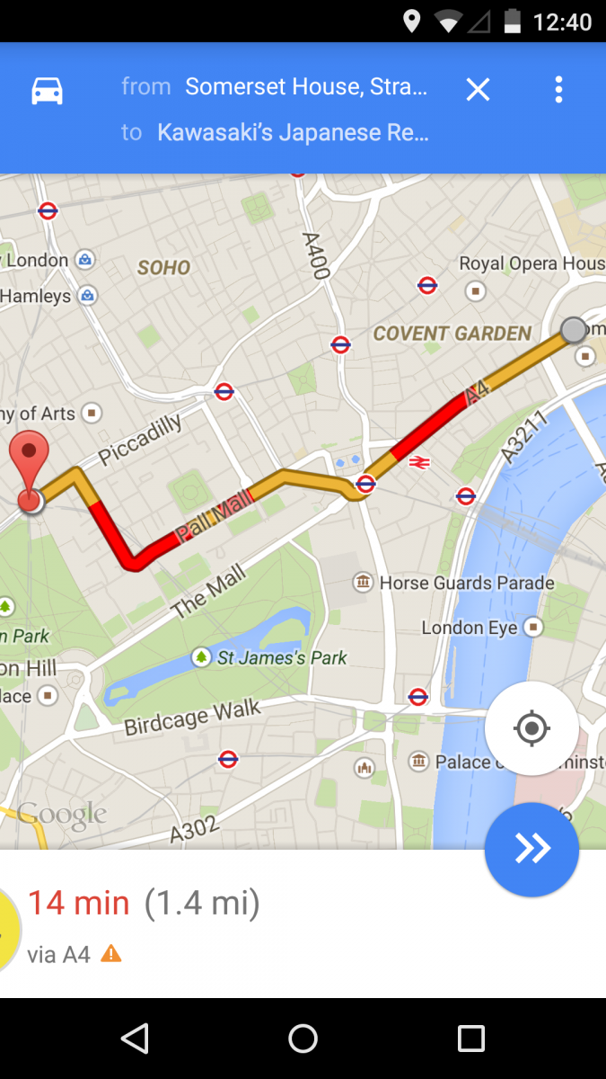
- The user tries to find a Japanese restaurant nearby that they remember starts with the letter "K". They either treat the assistant like a robot and ask it to list nearby Japanese restaurants or treat it like a human and add that they remember it started with the letter "K".
- Smarter driving
- The user asks Dragon questions about the route and has Dragon find the nearest gas station along the route.
- Texting and notifications
- A friend named Joe texts the user while driving. They have a conversation and Dragon intelligently saves a video that Joe sends rather than displaying it to the user.
- Changing settings
- The user opens and changes app settings.
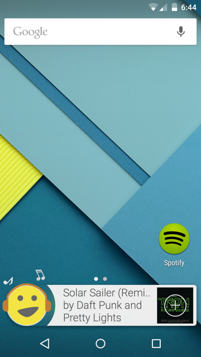
- Advanced music playback
- Dragon automatically displays the name of a song playing nearby and saves it to a Spotify account when prompted. The user then has Dragon turn on a party playlist, change it to something more "subdued", and then send the music to a pair of remote speakers.
Conclusion
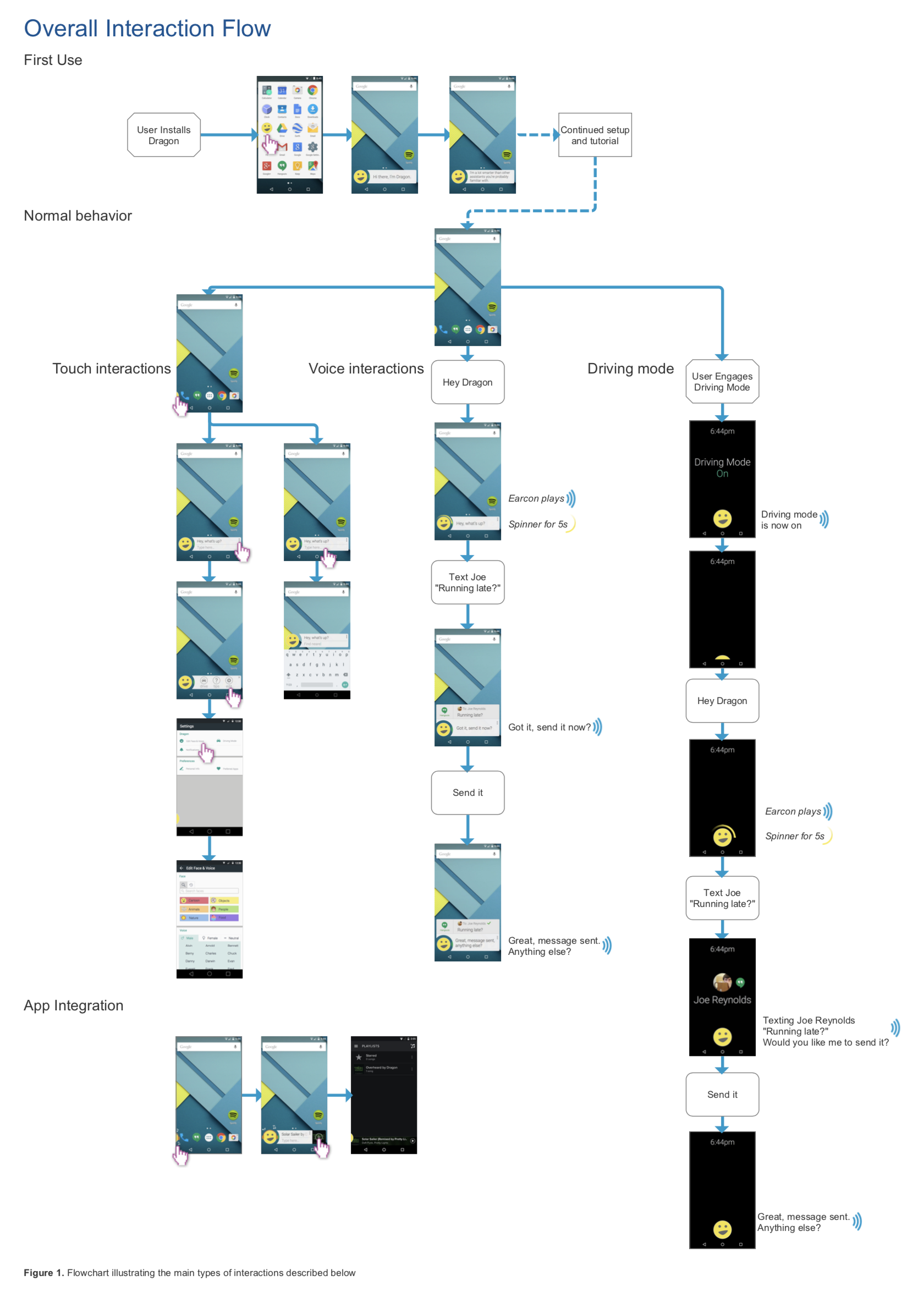
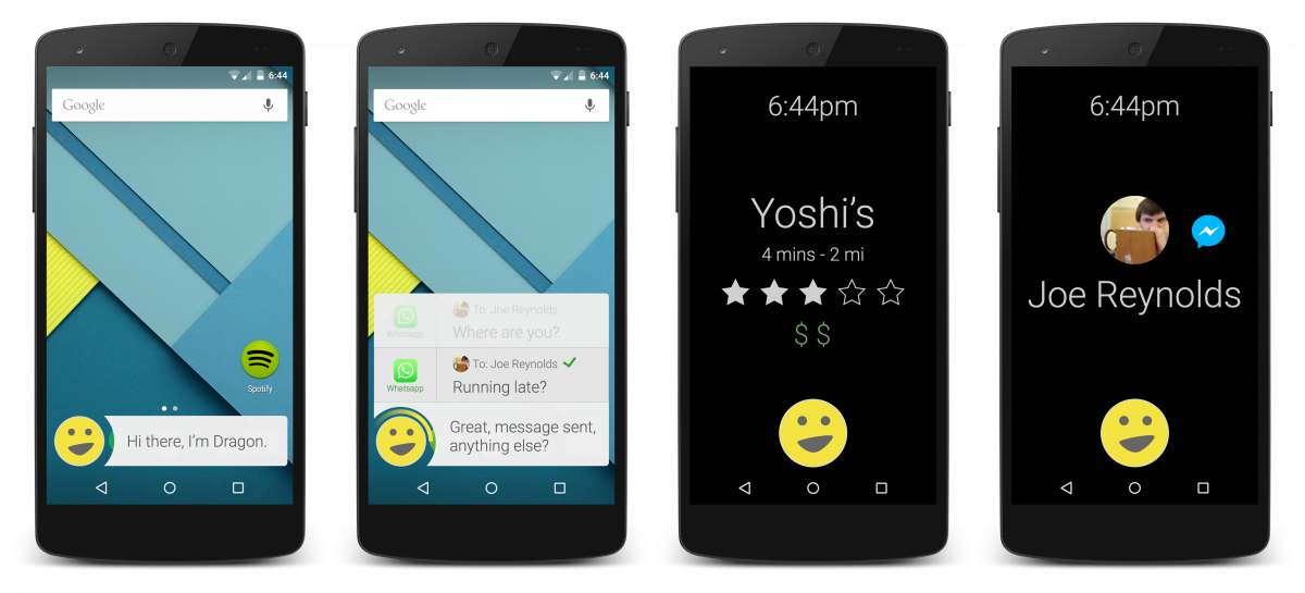
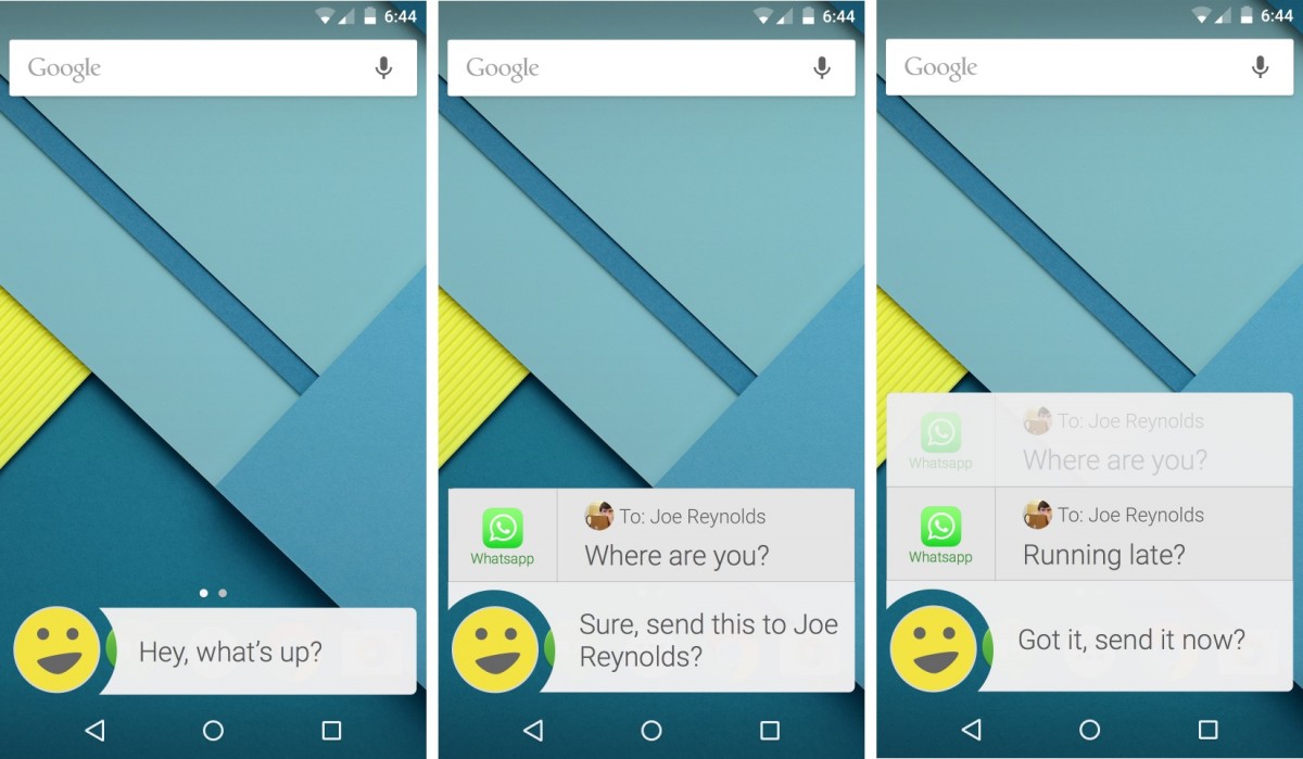
An example of the various interaction methods supported by our Dragon prototype
Our deliverables to Nuance Communications included a final report with all of our usability test findings and research, a design specification detailing every interface component and interaction method of our final prototype, an extensive list of research-backed feature ideas, and a set of short-term and long-term recommendations for the Nuance Design Team based on our findings. Here were a few of our suggestions:
- User interface and interactions
- Continue to invest in fast, accurate voice recognition and natural, conversational language patterns to reduce cognitive load in every context
- Consider an overlay-based interface that makes DMA feel less like a segregated app and more like a readily-available assistant that augments other apps (like Maps)
- Consider customization options and a "face" of DMA rather than a standard microphone icon
- Consider offering a chat-like history of conversations with the assistant
- Allow users to create custom macros for commands like "Good Night" that automatically adjust lights, open apps, play songs, or change system settings
- Auditory design
- Allow conversations to be interrupted and/or corrected by the user at any time
- Implement more intelligent prompting, i.e. prevent the assistant from repeating possible actions after every item in a list of results
- Proactivity
- Consider offering subtle, non-invasive recommendations like passive song identification or predictive messaging app selection based on the intended recipient
- Allow users to see and easily adjust incorrect assumptions within DMA's settings
- Driving mode
- Keep the screen on but limit visual UI elements to reduce mental load
- Restrict capabilities to only certain (common) tasks
- Allow the user to specify their own feature and notification "whitelist" that bypasses the default driving mode filters
Takeaways
Research-led feature development
In the years since this project's conclusion in early-2015, many of the feature ideas and recommendations we came up with have become available in the mobile assistants we use today in 2017. Trusting our research and prototyping based on proven user needs led us to ideas that were, in some cases, years ahead of their time:
- User-defined macros were popularized by Amazon's Echo in mid-2015 (first announced in late-2014)
- The ability for an assistant to "see" and interact with content on the user's screen was introduced as Google Now on Tap in late-2015
- Chat UI-esque, voice-optional interfaces were popularized by chatbots and Google Assistant in 2016
- The ability to toggle nearly any system setting was popularized by Bixby in early-2017
- Restricted driving modes with auto-replies became available on Samsung phones and iOS devices in 2017
Working with a dream team
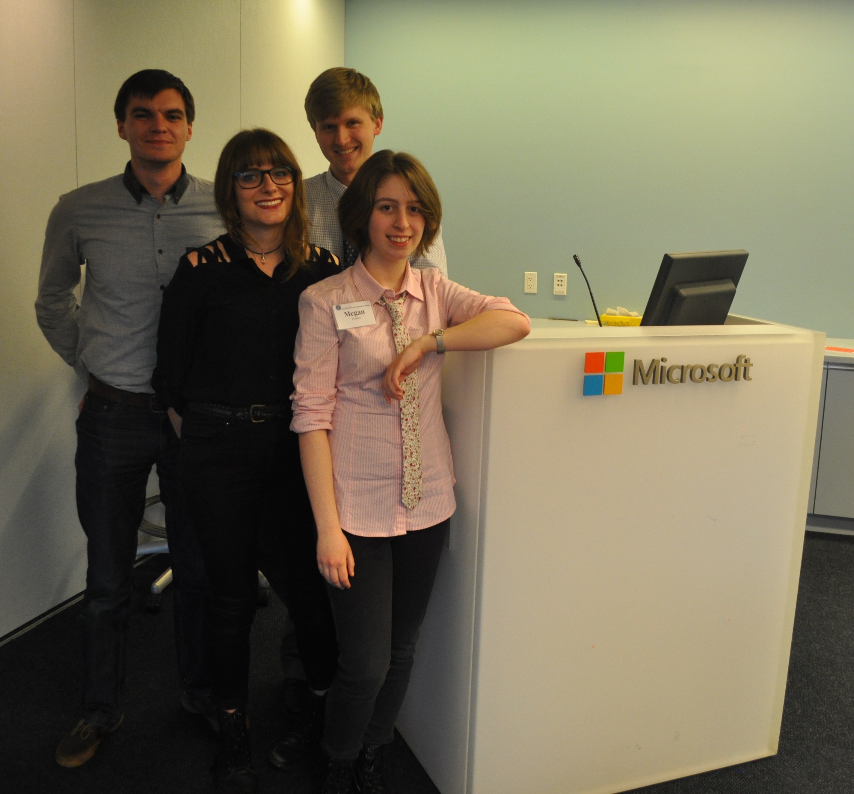
Chris, Allison, Andy, Meg
As much as I appreciated the academic rigor and realistic design process of this senior capstone project, the opportunity to work alongside and learn from these four team members at the height of their undergraduate careers is what I'll always remember and cherish the most:
- Nikki Dahan
- Meg France
- Chris Shinn
- Allison Kuperman
This was the same team that believed in the idea of Tufts MAKE enough to de-cream Oreos, practice webapp development, and run workshops with me throughout our time as undergraduates. Their degree of internal motivation and willingness to try new things is what enabled Tufts MAKE to succeed; greatly shaping my Tufts career and the creation of the Tufts Maker Network.
As a team, each of us cared greatly about both the quality of work that we did and the quality of life of each member. Our combined strengths nullified our individual weaknesses and our years of friendship gave us the kind of shared sense of trust and mutual respect that "dream teams" are made of. I feel lucky and honored to have been a part of this group, and my time with them was undoubtedly the highlight of my time at Tufts.
We ended up receiving a rarely-awarded "A" for this project, and I later learned that our final report became the go-to class example for succeeding generations of Human Factors students. Between this and Tufts MAKE, I couldn't be prouder.